The MidJourney team has constantly been improving their model to further the development of text-to-image AI systems. I started back when they were on V2 of their algorithm and previously wrote a review comparing V2 to V3 after V3 was launched. V4 brings new characteristics to MJ and has changed the game a bit.
The team teased us with V4 for awhile by talking about the development and also giving us the ability to rank images before the model was released. What we saw was a big change in the realism in the renders and accuracy. Keeping in step with how they’ve released the models, it just happened suddenly with very little warning. Fortunately I was able to interact with V4 a lot the first day and into the weekend.
One note: for this review I will *not* be comparing V4 to TEST/TESTP. TEST/TESTP are based on Stable Diffusion and brings with them all the issues SD has. While the models were good, I still felt there were limited and not fully expressive like MJ has the capability to be. For this review, I will be comparing V4 to both V2 and V3.
First off, V4 is incredibly impressive even though it is still considered being in Alpha. The renders are very realistic and show big improvement in what they can deliver. The team is finally closing the gap with Dall-E in terms of photorealism and prompt accuracy but still brings over the MJ aesthetic we have grown to love. Another benefit to V4 is that it produces the traditional 1024×1024 images in a 2×2 grid whereas TEST/TESTP only provided a 1×1 grid and used up double the GPU hours. It’s nice to have that back as I’ve started to be more frugal in my hour usage.
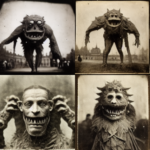
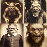
To start the comparison, I will be using the same prompt with a consistent seed and the default options for all the algorithms. Below is the V3 2×2 grid render with prompt details:
We’ll use the above grid as the baseline as we compare with V4. Using the same prompt and seed, below is the V4 grid output:
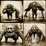
For one more baseline, below is the V2 output of the same prompt:
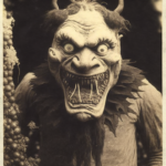
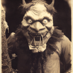
Immediately the differences stand out. For one, the MJ team has mentioned that V4 is a all new and doesn’t borrow from V2 or V3. Given how vastly different the initial grids are, I agree with the team that this is all new. Also, the V2 grid is somewhat similar to the V3 grid which further supports this. While both have rendered monsters, the V4 ones are in a portrait style where the V3 ones are a mix of portrait and full body. V4 also looks more “clean” than V3/V2. While I brought this up in my previous review of V3 removing some of the dirt that V2 had, V4 seems like even a future departure from this. Since we’re still in alpha with V4, we’ll have to wait and see if there will be options to adjust the output like we were able to in V3.
When it comes to the upscaling, the alpha qualities of V4 are more apparent. The upscale renders don’t seem as deep and the image quality appears far to bright. Running the renders through the beta upscale helps clean this up a bit, but hopefully the quality gets further refined as they make improvements.
V4 is a huge step forward for MidJourney as they become more realistic, accurate, and improve their model.

